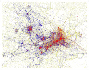
 Robert David Sullivan has a fascinating piece in the Boston Globe today on Eric Fischer, who has plotted on maps of Boston (left) and other cities where tourists (red) and residents (blue) take photos in their hometowns, based on what they post to the social-networking photo site Flickr.
As you might expect, Fenway Park and Faneuil Hall are heavily red, whereas blue predominates in the neighborhoods. Sullivan observes that neither captures the true Boston — it’s the tourist spots and the neighborhood joints together that form the most complete picture.
And it’s a great example of how coming up with new ways to visualize data help us tell stories we might not have even known existed.
Discover more from Media Nation
Subscribe to get the latest posts to your email.
