By Dan Kennedy • The press, politics, technology, culture and other passions

Tag: mapping

“68 Blocks” is a triumph of narrative and digital journalism

Part of the "68 Blocks" Instagram project

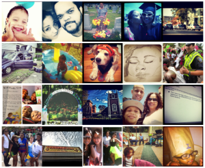
Part of the “68 Blocks” Instagram project

The timing was serendipitous. As the media swarmed around Newtown, Conn., following last Friday’s horrifying massacre, some observers were beginning to ask why so little attention was being paid to the ongoing crisis of urban violence. (Here’s one example, from The Phoenix’s Chris Faraone.)

On Sunday, the Boston Globe provided an answer of sorts: the first installment of “68 Blocks: Life, Death, Hope,” a five-day, multi-part series on Dorchester’s Bowdoin-Geneva neighborhood — a predominantly African-American community that is a vibrant center of family life but that is also beset by gangs and guns. The Globe went all in. The paper even rented an apartment in the neighborhood, where two of its reporters, Meghan Irons and Akilah Johnson, lived during the five months that they and others were doing their reporting.

It was only a week ago that the paper published an ambitious three-part series on the problems of immigration. The long-term prospects for the newspaper business may be bleak, but the Globe continues to produce important, expensive, time-consuming work.

At a time when you sometimes hear that various forms of digital storytelling have made narrative obsolete, “68 Blocks” is an example of how digital and narrative can work together. The story itself — 29,000 or so words spread out over five days — is unusual for newspaper writing. There is no news hook and, in the end, no real conclusion.

Thus we are left to wonder if Nate Davis and his wife, Trina Fomby-Davis, will be able to move on with their lives after the murder of one son and the imprisonment of another; if “Tal” will ever make something of himself; if Father Doc Conway can truly make a difference; and if Jhana Senxian will succeed in her efforts to remake her small part of Bowdoin-Geneva.

But if you’re only reading “68 Blocks” in print, you’re missing a lot. Fortunately the Globe has dropped the paywall for this package, so you can take the time to explore. It stands as a lesson in how to do multimedia, how to use data and how to involve your readers — “the people formerly known as the audience,” as Jay Rosen calls them — to help tell their own stories. For instance:

Instagram and voices from the neighborhood. My students and I have taken several tours of the Globe Idea Lab, an innovation skunkworks inside the paper’s Dorchester headquarters. The lab is dominated by a giant vertical screen comprising nine smaller screens. On it is a map of Boston, with geotagged Instagram photos popping up as soon as people post them. The Globe tracked down some of the amateur photographers in Bowdoin-Geneva, got their permission to use their pictures (unlike, uh, Instagram) and recorded brief audio interviews to go with each one. Rachel McAthy has more at Journalism.co.uk.

Kids using video to tell their own stories. This might be my favorite: the Globe distributed video cameras to young people in the neighborhood and posted the results. There are six short videos online, and every one is worth watching.

Interactive data visualizations. Using maps and charts, “68 Blocks” lays out in graphic detail a number of quality-of-life measurements ranging from homicides to rodent activity. By letting the user call up the data she wants, the visualizations invite repeated visits.

A photo tour of the neighborhood. With audio.

All of that is in addition to more typical offerings such as professionally produced videos, slideshows and diary entries written by Globe reporters.

This is a series that should have a long post-publication life — perhaps supplemented by an e-book. It’s a great example of what a large news organization is able to do if it’s got the resources and is willing to commit them to a long, complex project. Those of us who live in Greater Boston are lucky that the Globe is still taking on such important work.

A remarkable example of digital journalism

I’ll have much more to say about the Boston Globe’s remarkable “68 Blocks” series on life and death in the city’s Bowdoin-Geneva neighborhood.

For now, I just want to lay down a marker. Not only is “68 Blocks” a tremendous exercise in narrative journalism, but it’s likely to stand as a landmark in its use of multiple technological storytelling tools: mapping, data visualization and crowdsourced video and photography.

If you’ve been reading it on paper, do yourself a favor. Put it down and turn on your computer. You’re only getting half the story.

Sandy and the power of news maps

Click on image for full interactive map at BostonGlobe.com

We were lucky up here on the North Shore — we got lots of wind and plenty of rain from Sandy, but very little damage. We lost power for about a half-hour last night. When it came back, it seemed that the worst had passed.

But then we tuned in to CNN and saw the devastation that was taking place in New York and New Jersey. The aftermath will be with us for a long time.

As it turns out, it’s mapping week in my Reinventing the News class. Although classes at Northeastern were canceled on Monday, I’ve been sharing with my students some of the more interesting storm presentations being put together by news organizations.

Above is a map you’ll find at BostonGlobe.com plotting all kinds of Sandy-related reports — everything from photos and stories by Globe journalists to power-outage announcements and updates from other news organizations. It uses Leaflet, a tool I’m not familiar with, and OpenStreetMap, an open-source alternative to the increasingly commercialized offerings of Google, Apple and Microsoft.

I have not been able to puzzle out why some red dots are larger than others. I asked a source at the Globe, but he was too busy dealing with actual news to get back to me. I’d be curious to know the answer.

The New York Times is offering more of a meteorological tool — a map that tracks the path of Sandy and lets you call up a forecast for your community.

Also well worth a look is an interactive map put together by Google.org, the company’s nonprofit arm. Called “Superstorm Sandy,” the map lets you add and subtract various layers, including emergency shelters, YouTube videos and public alerts.

It’s part of an international effort called Google.org Crisis Response, which makes digital tools available wherever a disaster takes place.

Boston in red and blue

Robert David Sullivan has a fascinating piece in the Boston Globe today on Eric Fischer, who has plotted on maps of Boston (left) and other cities where tourists (red) and residents (blue) take photos in their hometowns, based on what they post to the social-networking photo site Flickr.

As you might expect, Fenway Park and Faneuil Hall are heavily red, whereas blue predominates in the neighborhoods. Sullivan observes that neither captures the true Boston — it’s the tourist spots and the neighborhood joints together that form the most complete picture.

And it’s a great example of how coming up with new ways to visualize data help us tell stories we might not have even known existed.

Mapping a class project

[googlemaps https://maps.google.com/maps/ms?ie=UTF8&hl=en&msa=0&msid=110849334117410151532.000482e5e1656ea61b23b&ll=42.344335,-71.083603&spn=0.044407,0.072956&z=13&output=embed&w=425&h=350]
I love this. My Reinventing the News class has put together a Google map of their favorite places within a mile of Northeastern. Each student wrote a blog post, took some pictures and then plotted it on a map, with a link.

The result — a “Newcomer’s guide to NU” — is a modest but useful example of how to use mapping as a journalism tool. The idea is to provide multiple points of entry for readers, which encourages them to explore and to come back.

The project was a bit of a high-wire act. I was having a hard time creating the map during the weekend, which may have been due to problems Google was having. Then, when everyone began adding to the map during class on Monday, we had barely controlled chaos, as random addresses began weirdly showing up and disappearing. Yet I think the end result turned out rather well.

Google Maps may not be the most sophisticated mapping tool available, but it’s free and ubiquitous. Understanding how to use it is just one of the skills today’s young journalists need to know.

What’s up with Google maps?

I’m looking for help with, or at least an explanation for, why I can’t create a Google map — something I’ve done a number of times before. I spent the better part of last night and this morning on it, and I’m ready to tear my hair out.

The problem is that the map I keep trying to create is not sticky. I create it, I save it, but then, when I go back to it, it’s showing a different map. And the link it generates is completely inconsistent, sometimes taking me to the middle of the country. (Mind you, the map I want has Northeastern University in the middle of it.)

This is for an in-class project we’re doing on Monday, so I really need to solve the problem. It is essentially the same project I did a little more than a year ago without incident, so, despite my ability to screw up even the simplest of tech tasks, I’m inclined to think it’s not me.

Have you heard anything? Do you have any suggestions?

Powered by WordPress & Theme by Anders Norén